I have always been very impressed by people who can: Extract Information from Data and turn it into Knowledge. In my day-to-day job there are 3 people who inspire me with either their vision, doing or both.
- John Rauser at Amazon, as I said before, this guy is pure awesomeness (99th percentile awesome) An inspiration to the entire team at Catchpoint when it comes to how we deal with data in our product. (2012 Velocity Video this is a must watch video)
- Matt Briggs, a “Brain” I worked with at DoubleClick and still have the good fortune to work with at Catchpoint. Matt can explain complex math problems to a 3-year-old! Check out his blog. Matt worked on various projects at DoubleClick from ad inventory management & forecasting, SLAs risk management, monitoring models & capacity planning. At Catchpoint he helps us with our math homework. Matt also did some work for the USAF but do not ask him about it, he will have to kill you!
- Leo Vasiliou who works at IAC and as many of our customers, he is very data driven and very very demanding about it (could have added a few more very). Leo is extremely good at putting in place mechanisms for detecting and analyzing data to explain problems and pattern changes that impact the web performance of their properties. (Check Leo’s blog for some amazing tricks and other excel models)
With his permission, I am re-publishing his latest post about HeatMaps and Web Performance Data. And I have to say, since reading it I have been modeling a lot of our customers data and it has been eye-opening and addictive!
Without further due:
Use color to add value to your Performance charts.
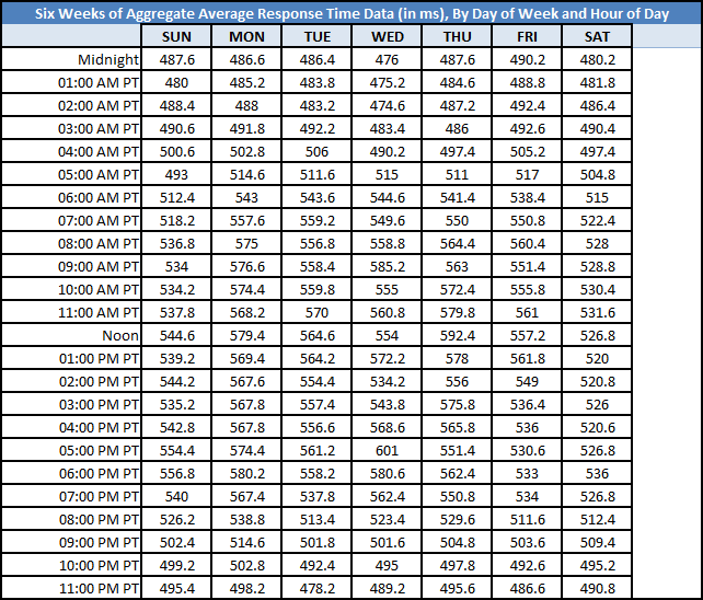
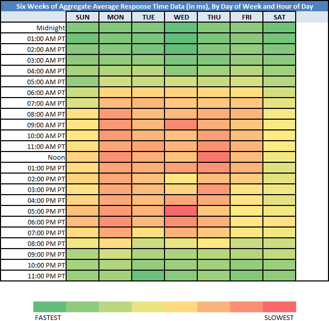
In this Heat Map example, web site’s Performance data is overlay with color, where red means “slowest” and green means “fastest” (with various color grades in between). I added this Heat Map example because the chart data was difficult to “crunch”, to analyze for patterns; adding color made this easier. Download the Excel sheet here. Otherwise, see the below “Before” and “After”.
Before: Raw Chart Data:
After: Heat Map:
Side by Side:
The chart data is the arithmetic mean average of six weeks’ worth of web site response time measurements (in milliseconds), broken down by Day of Week and by Hour of Day. I then used Excel’s built-in /Conditional Formatting/Color Scales/Red – Yellow – Green Color Scale/.
Document Complete / OnLoad:
_The following is optional reading material._
Here are some potential fact statements we get from looking at this Heat Map:
01. The weekends are the “fastest”.
02. The weekdays are the “slowest”.
03. Response Time slows starting at around 07:00 AM PT and Response Time speeds starting at around 07:00 PM PT.
04. The “slowest” (i.e. the most red) “Day of Week”/”Hour of Day” combination is Wednesday at 05:00 PM PT.
05. The “fastest” (i.e. the most green) “Day of Week”/”Hour of Day” combination is Wednesday at 02:00 AM PT.
06. Interestingly enough, the “fastest” and “slowest” “Day of Week”/”Hour of Day” combination was on a Wednesday.
07. Friday afternoons were “faster” when compared to other weekday afternoons (insert comment here RE: folks getting ready for the weekend!).
Download the Excel file here: https://docs.google.com/open?id=0B9n5Sarv4oonMEdtOTlvOHNib0E
********************************************************************************
I used his model to chart the performance heat map of Google Search (search for a keyword) and decided to compare the Wait time (1st byte) and their Search Query Time:
Here is the same for Etsy’s home page, Wait time and the Etsy server time:
(Data from June 1 2012 to July 13 2012, Time in EST)
I used these 2 examples mainly because not only we are plotting a Catchpoint metric but also overlaying customer telemetry coming from Google (how long it takes for Google to spit the results) or Etsy (how long it takes for their server to build the html). What would be cool is to get traffic volume during those days and hours to correlate the performance metrics and usage pattern. But what these chart show is clearly a performance degradation during certain days and hours of day that are driven by volume, users, usage…
Enjoy the Summer and try to keep your Web Performance Cool!
Thank you Leo for sharing this!
Mehdi – Catchpoint.


